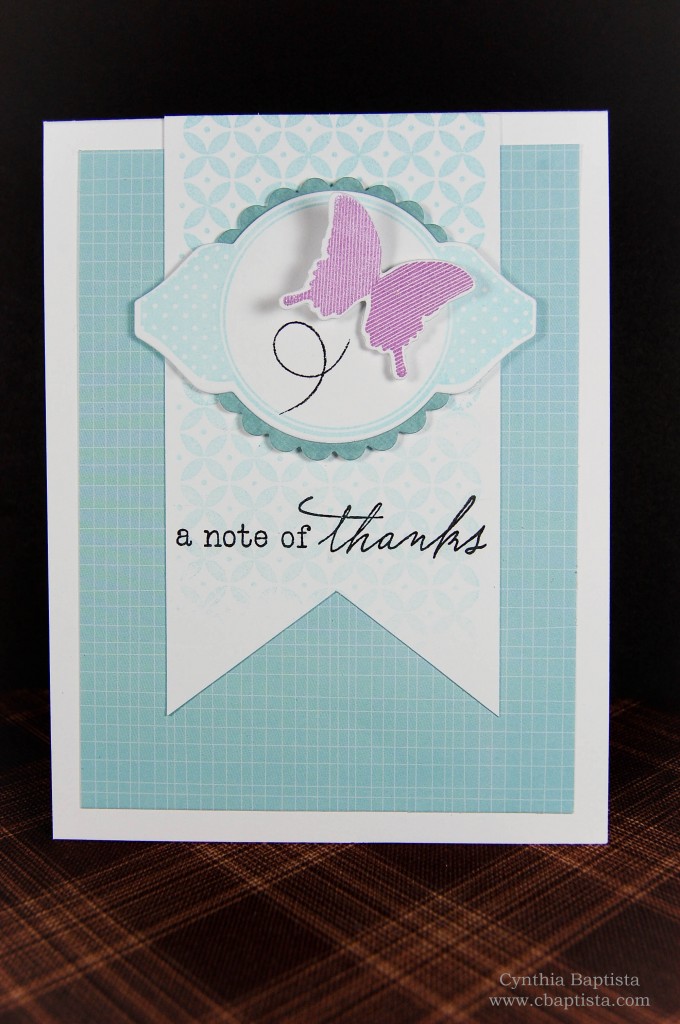
Ummm…yeah. Another one. Again, did you see the prize this week?! Lol! (Just a heads up…there’s gonna be a couple more…)

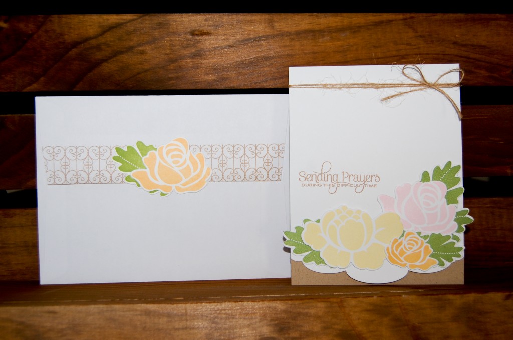
With this oversized card, I went with decorating a larger sized envelope. I wanted it to match the card so I stamped the pattern in ink that matched the kraft cardstock. I repeated the simple pattern on the back and attached a Rosie Posie flower and leaf die cut on the flap. I kept it simple to match the sentiment of the card. So easy yet it adds so much!
Thanks for stopping by!
~Cynthia
Supplies: Paper: Mowhawk VIA Vellum (kraft, 80#), Lynx Digital Paper (white, 100#) Stamps: Rosie Posie (PTI), Beautiful Butterflies (PTI), Background Basics: Wrought Iron (PTI) Ink: Thatched Straw (VersaMagic), Canteloupe (Momento), Pixie Dust (VersaMagic), Bamboo Leaves (Momento), Toffee Crunch (Moment0)Other: Rosie Posie Dies (PTI), Edger #3 Die (PTI), Natural Twine
This is my second take on the Make It Monday #100 Challenge (did you see the prize this week?!)…
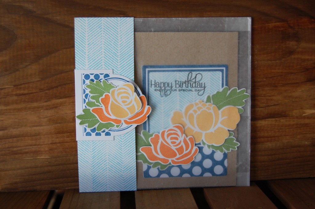
I’m still loving that herringbone pattern and had some left over scraps so before I put everything away, I made another card. This time, I used a glassine bag to package my over-sized card:
I wrapped a 2″ strip of cardstock stamped with that same herringbone pattern around the glassine bag and attached one half of a die cut label “clip” to the open ends. The other end of the paper “clip” is adhered to the backside of the wrap. Doing this forms a little pocket for the glassine bag to slide into. That “clip” is made from two Mat Stack 3 die cuts. I stamped one of the die cuts with the polka dot pattern from the Mat Stack 3 Collection and then scored about 1/4″ from the bottom and folded it, making a little flap. I trimmed off about 1/4″ from the bottom of the other die cut and then adhere it over the flap from the other die cut, making a little “clip”. I did this so it would look clean and symmetrical on the back side. Maybe this photo explains what I did better than my words?
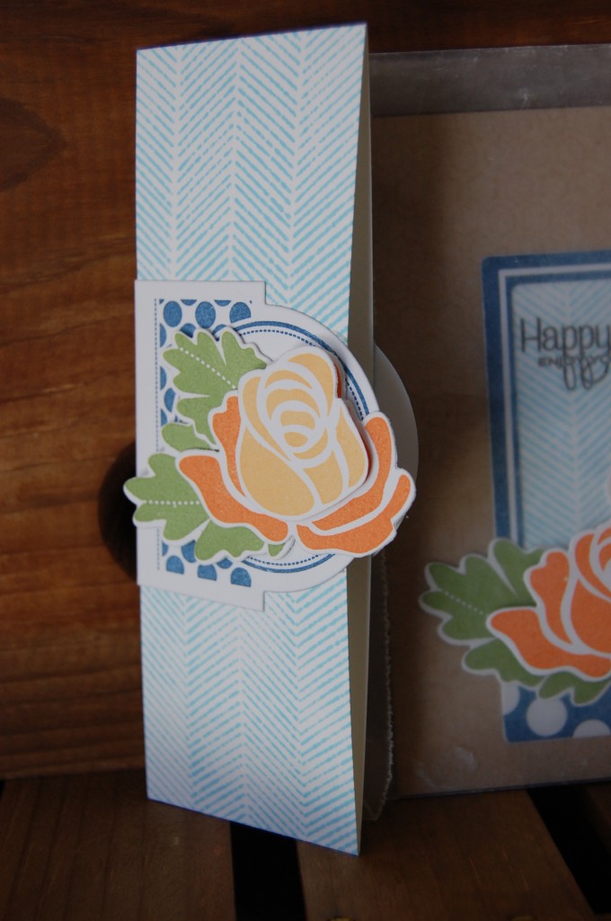
I folded the top of the glassine bag and then slid it into the wrap.
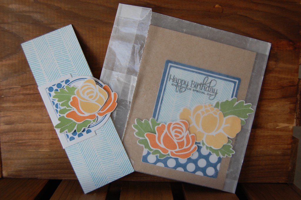
I really love how the glassine bag lets the card peak through it. It was pretty easy to make that little wrap too. When it’s all put together it looks like one big card!
Thanks for stopping by!
~Cynthia
Supplies: Paper: Mowhawk VIA Vellum (kraft, 80#), Lynx Digital Paper (white, 100#), Neenah Royal Sundance Cover (brilliant white, 80#) Stamps: Rosie Posie (PTI), Fabulous Frames (PTI), Beautiful Butterflies (PTI), Mat Stack 3 Collection (PTI), Interlocking Backdrops (lawn fawn) Ink: Tangelo (Momento), Canteloupe (Momento), Bamboo Leaves (Momento), Nautical Blue (Momento), Tumbled Glass (Tim Holtz Distress Ink/Ranger), Onyx Black (VersaFine), VersaMark Watermark Ink Other: Fabulous Frames Dies (PTI), Rosie Posie Dies (PTI), Mat Stack 3 Die, Glassine BagSometimes creativity has a mind of its own and when in the “zone” sometimes embellishments happen to find it’s way out of a standard A2 sized card’s boundaries. So, the Make It Monday challenge this week is to allow that creativity to flow and instead of limiting your project to the boundaries of the card size, adapt to it by coming up with a packaging solution to the “problem”.
I typically run into this packaging issue when I use floral embellishments. Parts of my leaves or petals tend to hang off the edge. I usually just use a plain, bigger envelope and that solves my problem. I still used a larger sized (A6) envelope with this card, but this time I prettied it up to match the card. I’m really digging the herringbone background pattern I stamped on the card so I decided to carry it on to the envelope. This is the front of the envelope:
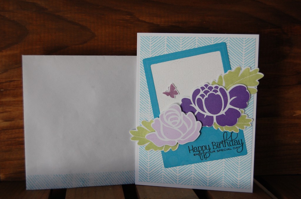
I stamped half of the herringbone pattern on the across the bottom of the front of the envelope. I wanted to keep the front of the envelope simple and to leave plenty of space for the addresses. And, here is the back of the envelope:
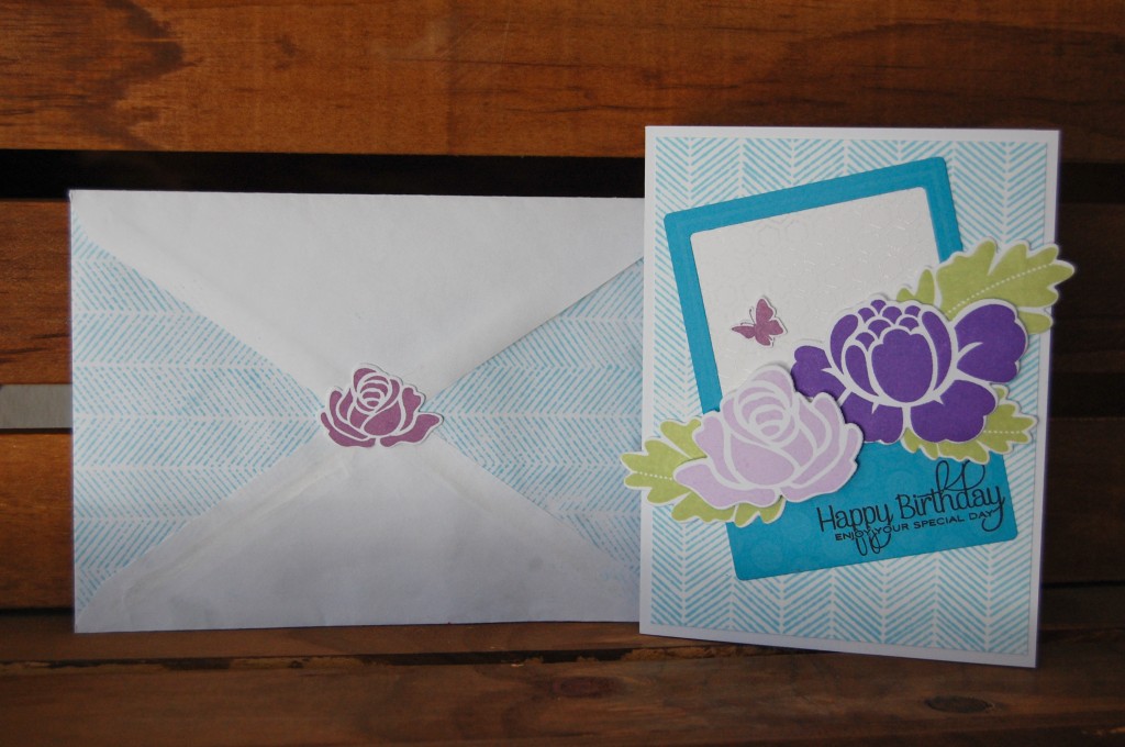
It is a bit more decorated. I took apart the envelope by steaming it open. Only I didn’t do a very good job of it (read: impatient), that’s why it looks a little weird. I stamped the left and right flaps with the same herringbone pattern, put the envelope back together and glued a little Rosie Posie die cut rose to the top flap. I’ll glue it down really well once the card is ready for mailing.
I really like how the decorated envelope makes the card look more “finished”. I’m going to have to start doing this more often!
Thanks for stopping by!
~Cynthia
Supplies: Paper: Lynx Digital Paper (white, 100#), Neenah Royal Sundance Cover (brilliant white, 80#), The Paper Company Stamps: Rosie Posie (PTI), Natural Beauties (PTI), Fabulous Frames (PTI), Beautiful Butterflies (PTI), Interlocking Backdrops (lawn fawn) Ink: Grape Jelly (Momento), Lulu Lavendar (Momento), Sweet Plum (Momento), Tumbled Glass (Tim Holtz Distress Ink/Ranger), Stick Candy (Jenni Bowlin/Ranger), Onyx Black (VersaFine), VersaMark Watermark Ink Other: Fabulous Frames Dies (PTI), Rosie Posie Dies (PTI), Clear Embossing Powder (Zing!/American Crafts)MIM #99: Repeats & Rainbows
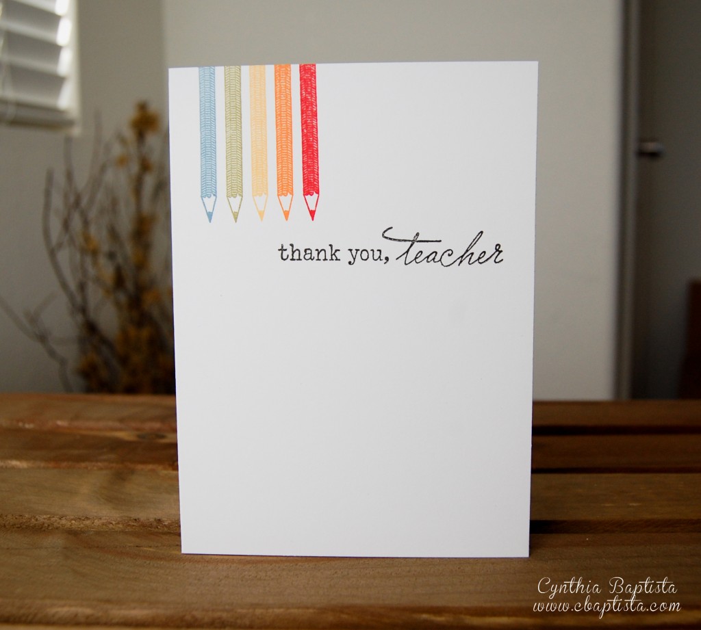
My take on this week’s PTI’s Make It Monday #99: Repeats & Rainbows:
I used Color Scheme #3
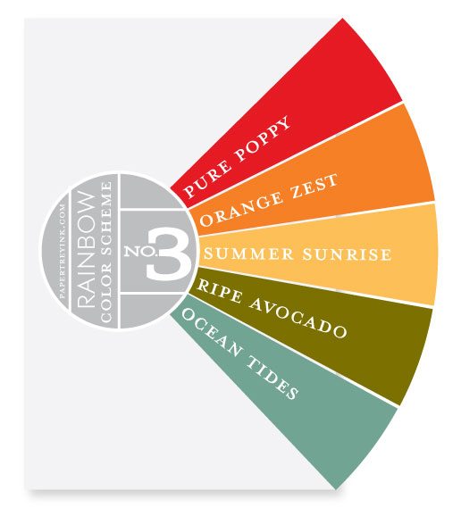
and created this:
Thanks for stopping by!
ETA: Card size = 4 x 5.5 in
~Cynthia
Supplies: Paper: Lynx Digital Paper (white, 100#) Stamps: Happy Trails (PaperTrey Ink)Ink: Aegean Blue (VersaMagic), Spanish Olive (VersaMagic), Canteloupe (Momento), Tangelo (Momento), Barn Door (Distress Ink), Onyx Black (VersaFine)
MIM #98: Chalkboard Technique
Happy New Year! It’s been awhile, hasn’t it? 2012 was a busy year and even though I didn’t keep up with my blogging, I did continue crafting. That’s what’s important, right? ;)
Anyway, I saw the Chalkboard Technique featured on this week’s Make It Monday and decided to give it a try. Chalkboard art is growing on me. And, I was really intrigued with using this technique on a card. This is what I came up with:
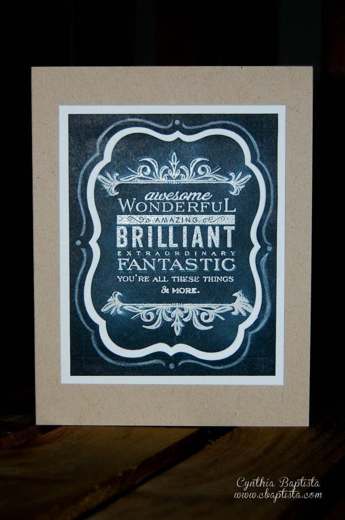
Overall, I’m really happy with how everything came together. I used a little masking to get the design layout just right. And, I was thrilled to discover how perfect the frame from Mat Stack 2 Collection turned out to be (I turned it into flourishes above and below the sentiment). I even enjoyed doodling with a white pencil more than I thought I would! But, I’m not happy with the execution. My white embossing powder turned bad but it was too late when I discovered it. I had already dumped the chunks onto the paper. Bummer. I continued with it anyhow and it didn’t turn out as bad as I thought it would. I also had a design change that still has left it’s mark. If you look closely (please don’t) you can see it. (White pencil doesn’t erase very well. Duly noted.) Despite all that, I am still happy with how it turned out. It’s definitely a technique I’ll use again…just with new embossing powder next time! ;)
Thanks for stopping by!
~Cynthia
Supplies: Paper: Mowhawk VIA Vellum (kraft, 80#), Neenah Royal Sundance Cover (brilliant white, 80#), The Paper Company (black)Stamps (all PTI): Mover & Shakers Sentiments, Mat Stack 2 Collection
Ink: Frost White (ColorBox) Other: Mat Stack 4 Die (PTI), Mat Stack 4 Layerz Die (PTI), White Pencil (Prismacolor)
Papertrey March Blog Hop Challenge
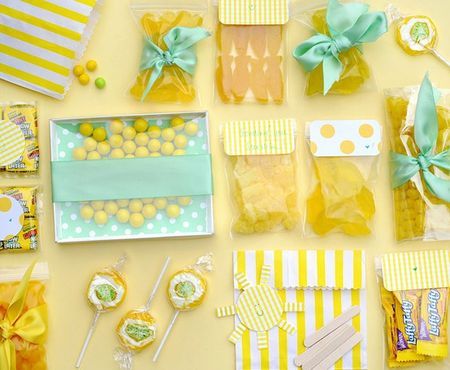
Papertrey Ink hosts a blog hop challenge every month and the image below is the inspirational photo for this month’s challenge. The details for the blog hop can be found here.
This is my first time participating in their blog hop and this is the card I came up with:
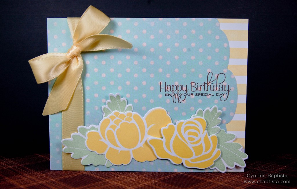
I chose to focus on the yellow and aqua color scheme, the striped and polka dot patterns, and the pretty bow in the photo. (I’m not sure why the aqua is showing up more blue in my photo. Trust me, it really is aqua ;) ) The color scheme was a little out of my comfort zone so that in itself was a challenge! Honestly, I was on the fence about participating in this challenge, partly because of the color scheme and partly because I’ve been in a creative rut for the past month or so (that’s what being sick for all of February will do to those creative juices! Ha!). I had a really hard time coming up with something, but I’m glad I pushed through it because I’m pretty pleased with the final results. Thanks for stopping by! :)
~Cynthia
Supplies: Paper: Lynx Digital Paper (white, 100#), Prima (patterned paper) Stamps (all PTI): Faux Ribbon, Rosie Posie, Beautiful ButterfliesInk: Aloe Vera (VersaMagic), Dandelion (Momento), Jumbo Java (VersaMagic), Thatched Straw (VersaMagic)
Other: Edger #3 Die (PTI), Rosie Posie Dies
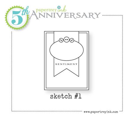
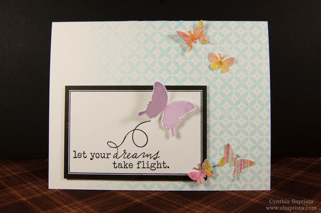
PTI Day #6: A Sketch Challenge
The challenge over at PTI today is to create a project based on one of the 5 provided sketches. I chose to make a card from sketch #1:
The background is a patterned paper from an old DCWV stack sized to 3 3/4″ x 5″ and adhered to the white cardstock base. The large flag was cut to 2 1/2″ x 5 1/2″. I hand cut the “V” and then trimmed about 1″ from the top. The finished length is 4 1/2″. I did it this way instead of cutting it down to size right away so that I could control the final length of the flag since I was hand cutting the “V”. I didn’t want to come up too short. (Don’t ask how I know…) I then stamped the pattern onto the flag and purposely had it fade away towards the bottom. As luck would have it, the size of that Martha Stewart background stamp was the perfect width that by centering the stamp, it left borders on the right and left sides of the flag. I didn’t have to have the image bleed off of the flag if I didn’t want it to. I really liked the clean look it gave by doing it this way. I finished the tag off with a sentiment from the Happy Trails stamp set and adhered that right over the background. I created the focal element by stamping the mat stack 2 die cut in Sea Breeze. I stamped the little trail from Happy Trails and popped a Happy Trails butterfly die cut stamped in Pearlescent Purple ink onto the mat. I finished it off by adhering a scalloped circle die cut right behind the mat stack and then adhering the whole thing onto the card using some foam adhesive. I really liked the 5 sketches that were provided and hoped to have made more cards from them. But, it’s getting late and I need my sleep so I think that’s all I’ll be able to do today. I”m going to hang on to the rest of the sketches though and attempt them some other time. Have a good night!
~Cynthia
Supplies: Paper: Lynx Digital Paper (100#), DCWV, PrimaStamps (all PTI, unless noted): Mat Stack 2 Collection, Happy Trails, Background Patterns (Martha Stewart)
Ink: Onyx Black (Versafine), Sea Breeze (VersaMagic), Pearlescent Purple (Brilliance) Other: (all PTI): Happy Trails, Mat Stack 2 Die, Limitless Layers: 1-3/4″ Circle Collection
Papertrey Ink & Pinterest #2
I’m back with another card. This time I found inspiration from Danielle Flanders’ Pinterest image:
I love the soft colors and the pattern on the right side. I really should be sleeping right now, so I’m going to show you what I made from that photo and then update this page when I get a chance tomorrow. Here it is:
Good night!
~Cynthia
Supplies: Paper: Lynx Digital Paper (100#), Prima Collection Pattern PaperStamps (all PTI, unless noted): Label Basics, Happy Trails, Background Patterns (Martha Stewart)
Ink: Onyx Black (Versafine), Spring Pansy (VersaMagic) Other: Butterfly Punch (Fiskars), Butterfly Punch (small) (EK Success)
Papertrey Ink & Pinterest
I just recently got on the Pinterest bandwagon. And, I must say, what a great place for crafty inspiration! So, what is Pinterest? It’s basically a virtual pinboard. You pin things you find on the internet that you want to reference later. You can search on Pinterest too and re-pin things of interest. The best thing is that it remembers the source of the pin so that you can go back to the original link. I’ve had a Pinterest board for awhile now but only recently really started to use it. But, with the announcement over at Papertrey Ink that they now have Pinterest boards categorized by project, you can bet I’ll be using Pinterest a lot more in the future. What a great source of PTI specific inspiration! Check it out
So, in honor of their presence on Pinterest, each design team member has chosen an inspirational Pinterest image and created a project based on that. And, the challenge today is to pick one of the team member’s Pinterest inspiration photo (or find one yourself on Pinterest) and create a project inspired from it. I chose to create a project from Lisa Johnson’s inspiration photo:
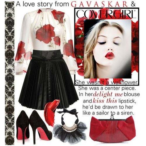
I love the color combination: black, white, and red. I have always loved this color combination. But, it was that decorative strip on the left side that was the deciding factor in choosing this as the photo I wanted to work from. This is what came from that inspiration photo:
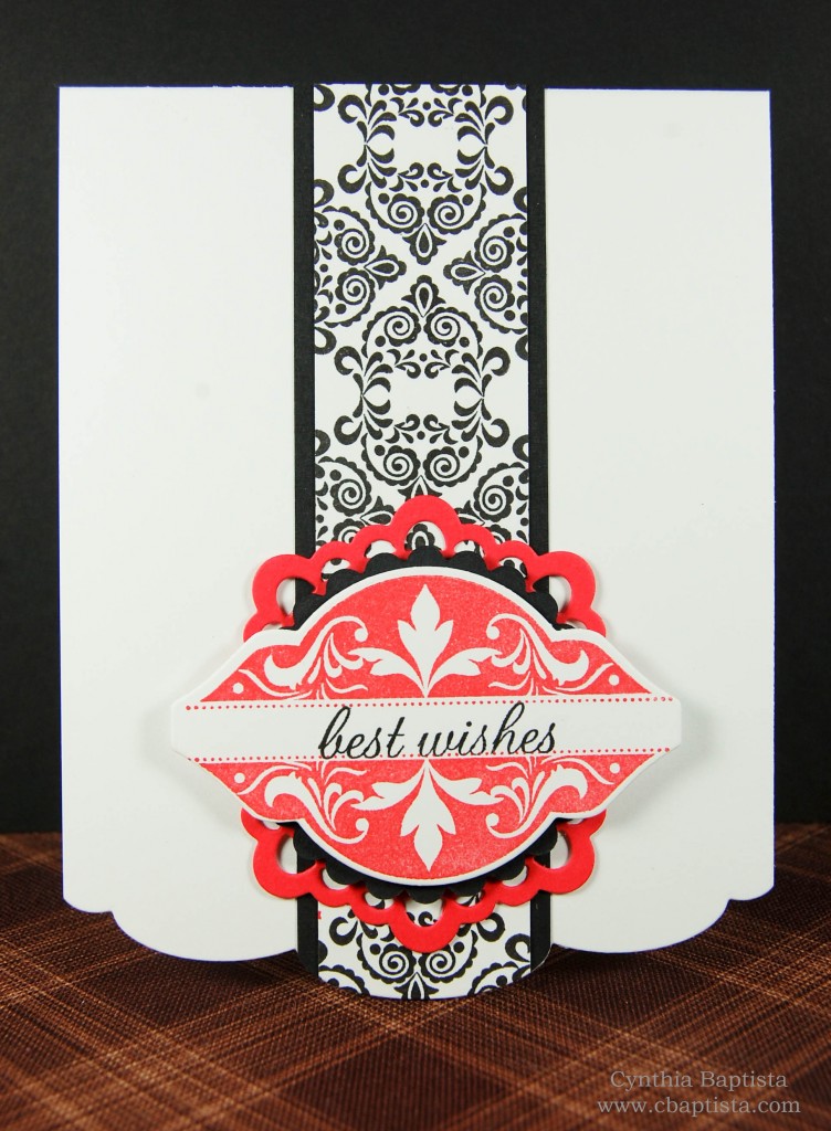
Yes, similar layout as my previous card…but I just like it so much. I love how the decorative strip running down the center turned out. I used the small flourish stamp (not sure how to describe it) from Mat Stack 2 Collection to create that pattern. I really, really like how it turned out…I may have to make more! Thanks for stopping by!
~Cynthia
Supplies: Paper: Lynx Digital Paper (100#), The Paper CompanyStamps (all PTI): Mat Stack 2 Collection
Ink: Onyx Black (Versafine), Red Magic (VersaMagic) Other (all PTI): Mat Stack 2, Limitless Layers: 1-3/4″ Circle Collection, Doily Details Collection, Edgers #3 Collection
PTI Anniversary: Color Challenge
Papertrey Ink is celebrating it’s 5th Anniversary this month. Along with their monthly sneak peeks and release on the 15th, there are also special announcements and challenges with fabulous prizes to be won thrown into the mix! Today’s challenge is a Color Challenge. Each of the design team members chose their favorite color combinations from the last year and the challenge is to create a new project inspired by one of those combinations. This is the color combination I chose:
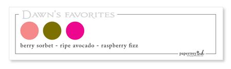
This is Dawn McVey’s favorite color combination. I don’t own any of Papertrey’s color products so I did my best matching those colors to what I have on hand. This is what I came up with:

I used the freebie image (that was designed by Dawn) from the other day. I thought that was a fairly good way to have those colors represented. This was my first color challenge ever and I’m pretty pleased with how it turned out. I chose this combo because I’ve always admired and loved how Dawn uses colors in her projects. I wanted to get a taste of what that feels like. :) It was pretty fun playing around with such vibrant colors! I’m surprised by how much I ended up liking this color combination. What do you think? Did I do alright with this color challenge?? Thanks for stopping by!
~Cynthia
Supplies: Paper: Lynx Digital Paper (100#), Core’dinations Stamps (all from PTI): Background Basics: Text Style II, Mat Stack 2 Collection, Polka Dot Basics IIInk: Pearlescent Olive (Brilliance) Other: Mat Stack 2 (PTI), Limitless Layers: 1-3/4″ Circle Collection (PTI), Edgers #3 Collection (PTI), 1-3/4″ Punch (EK Success)